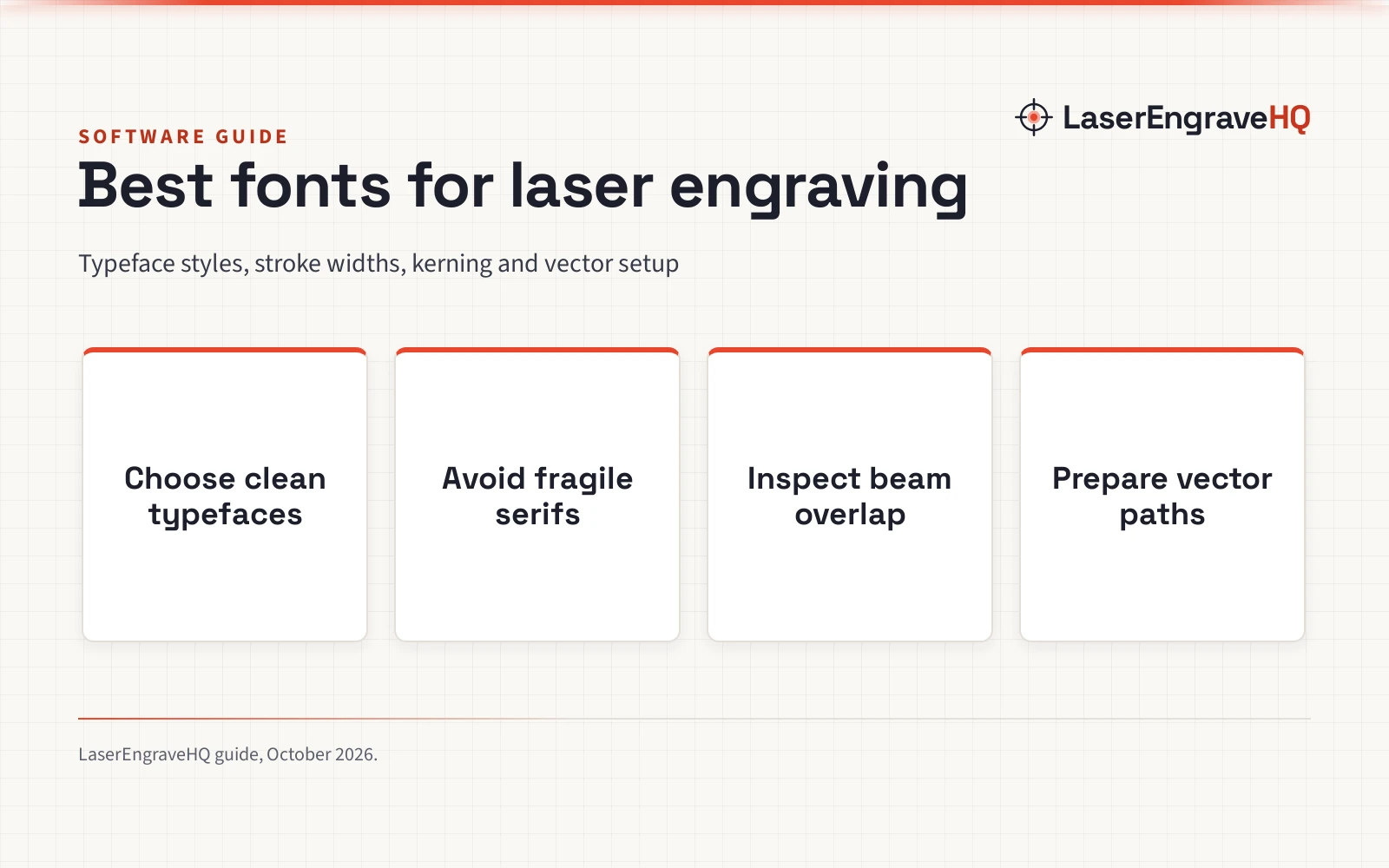
Best Fonts for Laser Engraving: Typeface Selection and Vector Setup Guide
A practical guide to the best fonts for laser engraving: learn which open typefaces mark cleanly, how beam kerf impacts line width, and how to format vector text.
On this page
The best fonts for laser engraving are free, open-license sans-serif typefaces like Montserrat and Roboto, sturdy serif options like Merriweather, and specialized single-line or stencil fonts for cutting and scoring. Laser engraving requires typography with uniform stroke thickness, open counters, and adequate spacing so the beam does not merge adjacent characters or fill tight counters. The sections below explain how to select, space, and prepare font files step by step for crisp results on wood, acrylic, and metal.
As an Amazon Associate I earn from qualifying purchases. LaserEngraveHQ earns a commission from purchases made through these links, at no extra cost to you. Read our affiliate disclosure.
All typefaces recommended in this guide are free, open-source fonts available for personal and commercial projects. Commercial font licenses often restrict embedding or converting glyphs into cut paths, so always confirm that your font license permits outlined vector production before selling engraved goods.
Step 1: Choose the right typeface category
Selecting the right typeface category prevents engraving errors before powering on your machine. Different font styles react differently under a laser beam, where heat concentration alters letterforms compared to on-screen previews.
Sans-serif fonts: Geometric and humanist sans-serif typefaces are the most dependable choices for laser work. Fonts like Montserrat, Roboto, Open Sans, and Lato provide even stroke weights across every letter. Because vertical stems and crossbars share similar thickness, the beam delivers consistent energy across words, keeping open counters inside characters like ‘e’, ‘a’, and ‘o’ clear of char.
Sturdy serif fonts: Serif fonts with extreme contrast struggle because hairline serifs blur under heat while thick stems overburn. If your project requires a classical style, choose low-contrast serif typefaces like Merriweather, which retain robust serifs that endure heat without losing definition.
Single-line and stencil fonts: Single-line typefaces define characters with an open vector path rather than a closed outline, allowing machines to score lettering in a single pass. When cutting through sheets, interior counters fall out unless you choose stencil typefaces like Allerta Stencil with integrated bridges.
Step 2: Understand beam kerf and stroke weight
A laser beam vaporizes a narrow kerf as it strikes material. In raster engraving, beam width expands dark marks into negative space, shrinking internal counters. In vector cutting, kerf reduces the physical width of cutout letters.
Machine specifications illustrate this physical limit. For example, the ELIDOR Z6 6W laser engraver lists a laser spot of 0.04 by 0.14 mm with an engraving accuracy of 0.01 mm across a 300 by 300 mm work area, reaching speeds up to 10,000 mm/min. Marks on the workpiece reflect that focal spot, meaning letter loops and spacing must remain larger than the spot size of your machine.
When cutting letters out of sheet stock, apply an outward kerf offset so the beam does not reduce delicate stems. For raster engraving, choosing a bolder font weight prevents fine lines from blurring.
Step 3: Adjust kerning and letter spacing
Kerning controls spacing between letter pairs, while tracking adjusts spacing across an entire word. Standard fonts are spaced for print or screens, where heat bleed does not exist. Under a laser, thermal bleed spreads outward from the cut zone into surrounding fibers.
When characters sit too close together, scorch marks overlap, causing adjacent letters to blur. Expanding your tracking creates a buffer zone that lets heat dissipate cleanly. Increasing line spacing likewise prevents scorching between stacked lines of text.
Step 4: Match font choices to your workpiece material
Workpiece materials respond differently to thermal vapor and smoke:
Wood and plywood: Wood grain and natural resins cause fine lines to bleed. For crisp marks on wood, select medium to bold sans-serif fonts. Using uniform panels, such as those in our guide to wood sheets for laser engraving, reduces resin flare around text.
Acrylic and signage plastics: Cast acrylic vaporizes cleanly, leaving sharp edges. Two-tone plastics yield high contrast; for instance, Oubit lists two-tone acrylic sheets measuring 12 by 8 inches where the laser removes surface foil to reveal dark lettering.
Commercial plates: Providence Engraving lists acrylic name tags measuring 1.5 inches by 3 inches holding up to 3 lines of text with 9 fonts. For larger signs, Lasercrafting produces signage plates measuring 8 inches by 2 inches, showing how larger areas allow wider letter spacing.
Bare metal: Marking bare metal with diode or CO2 beams requires marking compound, while fiber systems mark metal directly. OMTech lists laser marking spray for bare metals that binds under a 25W or higher CO2 laser, drying in 2 minutes with warm air or under 5 minutes at room temperature.
Safety warning: Never laser engrave PVC, vinyl, PVC faux leather, polycarbonate, or ABS. PVC and vinyl release corrosive chlorine gas that destroys optics, while ABS and polycarbonate release heavy toxic smoke and present fire risks. Always operate ventilation as outlined in our fume extractor guide, and ensure eyewear meets rated protection by checking our laser safety glasses guide.
Step 5: Convert text to curves and inspect vector nodes
Laser software does not process live font files reliably. Convert all text objects into vector curves or outlines before production. Learn more about preparation in our guide to laser engraver file types and our tutorial on laser engraving software for beginners.
Converting text to curves preserves exact letter shapes and prevents missing font errors. Always inspect vector nodes after conversion. Overlapping cursive script tails create intersecting paths that slice through letters in vector mode or leave empty gaps in raster fill mode. Use your software’s ‘Weld’ or ‘Union’ command to combine overlapping letters into a continuous silhouette, and remove redundant nodes for smooth machine motion.
Step 6: Select fill modes and optimize machine settings
Select vector line scoring or raster fill engraving depending on font geometry.
In raster fill mode, the laser head sweeps back and forth, vaporizing the interior of characters. This suits bold sans-serif lettering. Speed affects edge clarity; for example, the LaserPecker LP2 Plus features a 10W diode laser reaching raster speeds up to 4000mm/s, reducing heat soak into surrounding material.
Vector scoring follows paths directly: it outlines standard fonts and traces single-line fonts along their centerline. Precise focus is critical; for example, LaserPecker specifies a 200 mm distance between the lens and workpiece for the LP1 Plus to maintain focus, while other models use focus gauges. To compare machine capabilities, see how to choose a laser engraver.
Step 7: Run sample marks and calibrate line intervals
Run a sample pass on scrap stock before engraving finished blanks to confirm legibility and depth.
Calibrate your line interval carefully. If spacing is too wide, visible gaps stripe the letters. If spacing is too tight, repeated heat causes charring and closes small counters in ‘e’, ‘a’, and ‘o’. Inspect the sample under good lighting to confirm clean edges before starting full production.
Common mistakes to avoid
- Using ultra-thin or hairline fonts whose delicate features blur or burn out under beam kerf.
- Leaving cursive script lettering unwelded, creating cut lines or void gaps through overlapping letters.
- Setting kerning too tightly, causing heat bleed and scorched bridges between characters.
- Engraving small-point fonts on coarse-grained softwoods that bleed along fibers.
- Neglecting to convert live text into vector paths before exporting files.
- Cutting through letters with closed counters without using stencil bridges.
Best fonts for laser engraving: the short version
- Choose sturdy, open-license sans-serif typefaces like Montserrat or Roboto for general text, and stencil fonts for cutout letters.
- Avoid delicate serifs, hairline scripts, and high-contrast letterforms whose fine details blur or overburn under the beam kerf.
- Increase tracking and letter spacing to provide a buffer against thermal bleed and charring.
- Convert all live text objects into outlines or vector paths in your design software.
- Weld overlapping cursive script characters into a unified vector path.
- Set proper focal distance and calibrate line interval on scrap material before running final production.
FAQ: lasers and CNC
What font style is easiest to laser engrave?
Medium-weight sans-serif typefaces like Montserrat, Roboto, and Open Sans are the easiest fonts to engrave. Their uniform stroke widths and open counters prevent heat pooling across wood, acrylic, and coated metal.
Can I laser engrave standard script and cursive fonts?
Yes, but you must weld overlapping letters first. In cursive fonts, character tails cross each other. Welding removes intersecting lines that slice through text in vector mode or create empty gaps during raster engraving.
Why do delicate font details get lost on wood?
Kerf expands raster marks, which fills small counters and blurs fine lines. When cutting letters completely out of wood, kerf burns away thin stems entirely. Wood grain also conducts heat, scorching delicate details.
What is a single-line font and when should you use it?
A single-line font defines characters with a single vector path rather than an outline. Use them for fast vector scoring on industrial serial plates, equipment tags, or high-volume small badges.
Do I need to convert text to outlines before laser engraving?
Yes. Converting text to curves turns fonts into raw vector lines, preventing missing font errors and enabling you to weld overlapping cursive characters and adjust vector paths.
Where can I find free fonts for laser engraving?
Google Fonts offers free, open-source typefaces under licenses like SIL OFL or Apache that permit commercial engraving. Top picks include Montserrat, Roboto, Open Sans, Merriweather, and Allerta Stencil.
Related: the laser software guide, laser engraving software for beginners and laser engraver file types. Also see our best laser engraver for wood and best laser engraver for small business.